
The Healthy Wallet
The Healthy Wallet is a digital platform focused on helping people build healthier financial habits through education, planning, and goal tracking. Designed as an approachable personal finance tool, it empowers users to take control of their money with clarity and confidence especially those just starting their financial journey.
Client
Brielle Bryant Erales
Overview
The core objective was to make financial planning approachable — especially for users who found traditional tools overwhelming or too complex to start with. The design process focused on simplifying financial decision-making while maintaining user motivation through visual clarity and thoughtful UX.
Team
1 Product Designer
2 UI Designers
2 UX Researcher
1 Owner
Timeline
3 Months
Visual Language
Product Experience
Information Architecture
Stakeholder Communication
My Responsibilities
Process
1
Week 1-4
Discovery & Foundation
Ideation & Research
-
Defined the platform's core purpose and audience (first-time financial planners, especially women of color)
-
Conducted competitor analysis (YNAB, Rocket Money, Good Budget, etc.)
-
Identified gaps in current financial tools (lack of personalization, emotional support, poor UX for beginners)
-
Designed and distributed a user survey to gather behavioral insights
2
Week 5-6
Structure
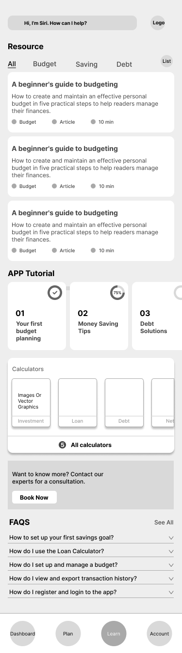
With research insights in place, the second month shifted toward building the structure and initial user experience. The first step was developing the information architecture, mapping out the app’s key sections such as Plan, Learn, Accounts, and Settings. Navigation flows were designed to minimize user friction and promote intuitive progress through the app’s tools.


3
Turning Features Into Flows
Wireframing began shortly after, focusing on low-fidelity drafts for major features including onboarding flows, personalized budgeting tools, linked accounts, debt calculators, and educational content modules.
Throughout this phase, layouts were continuously refined through weekly feedback sessions with stakeholders and faculty reviewers.
Week 6-8
Special attention was given to interactive opportunities like Help Mode, chatbot support, and embedded micro-goals, ensuring that every part of the app aligned with user needs and kept the experience approachable rather than overwhelming.


4
Week 9-10
High-Fidelity Design & Prototyping
This phase focused on translating the wireframes into a polished, high-fidelity interface aligned with the brand’s personality. Interactive prototypes were developed in Figma to simulate end to end user flows, including onboarding, budgeting, and educational interactions. Walkthrough sessions with stakeholders provided early validation for the visual tone, pacing, and clarity of navigation.
Outcome: Delivered a fully designed, clickable prototype that reflected the product’s intended emotional tone and usability setting a solid foundation for stakeholder sign-off and development readiness.
5
Week 11-12
Developer Handoff & Final Delivery
Once the high-fidelity screens were approved, the focus shifted to preparing for implementation. Annotated UI screens, component specifications, and usage documentation were organized in Figma for clarity. The design system including buttons, inputs, spacing tokens, and visual behavior was cleaned up and aligned with developer expectations.
Outcome: A complete handoff package was delivered to the development team, enabling a smooth transition into build.

Learnings
Balancing depth and simplicity was harder than expected.
The app needed to display a wide range of financial tools including budget breakdowns, savings matrices, debt calculators, and progress dashboards. The challenge was figuring out how to organize dense content and complex calculations into flows that felt lightweight, intuitive, and non-threatening. It required constant editing, testing, and questioning: What’s actually essential on this screen? What can wait?
Consistency across components sounds simple but it isn’t.
Small misalignments in button styles or spacing tokens showed up late, and standardizing them added unexpected cleanup time. The lesson: invest in system thinking early to save time later.
Handling complexity was harder than I expected.
This was my first time working on a product with so many interconnected tools, dashboards, and pages. Figuring out what content belonged where and how it would all connect got overwhelming fast. The sitemap was detailed to the point of chaos. I found myself constantly revisiting what each page was supposed to do, what sections were really necessary, and how to make it all feel simple to someone seeing it for the first time. It pushed me to think more structurally, not just visually.