
Union Oyster House
Union Oyster House is the oldest continuously operating restaurant in the United States, serving classic New England seafood in the heart of Boston since 1826. Known for its historic charm, loyal customer base, and tourist appeal, the restaurant is a landmark that blends tradition with hospitality.
Client
Academic Project
Overview
This redesign project began as part of a college course focused on identifying websites that would benefit from a refreshed user experience. The Union Oyster House website was selected due to its outdated layout, cluttered navigation, and lack of responsive design. The goal was to modernize the interface while preserving the restaurant’s legacy and character.
The redesign focused on simplifying the user journey, making reservations and menu access more intuitive, and creating a visual style that honored the brand’s history while bringing it into a more accessible, mobile-friendly format.
Team
Solo
1 Mentor
Timeline
4 Months
Desktop & Mobile Design
Visual Redesign
Brand Preservation
Content Restructuring
My Responsibilities
Process
1
Week 1-3
Identifying Redesign Opportunity
Site Selection & Brand Discovery
Began by evaluating Union Oyster House’s existing website, identifying key usability issues such as outdated design, poor mobile performance, cluttered navigation, and lack of visual hierarchy. Conducted a competitive analysis to benchmark against other modern restaurant websites and understand industry best practices. Simultaneously, carried out a deep dive into the brand’s legacy—studying its history, customer reviews, and visual identity to define its core values, tone, and storytelling opportunities.
Outcome: Established a clear strategy and design direction focused on enhancing usability, elevating brand storytelling, and modernizing the site while preserving its historic identity.
2
Week 4-7
Structure & Planning
Created a detailed sitemap to restructure the website’s navigation and content flow based on user goals—prioritizing key actions like viewing the menu, making reservations, and learning about the restaurant’s history. Followed this with low-fidelity wireframes for both desktop and mobile, focusing on layout clarity, logical content grouping, and smooth task flows. Applied best practices for page hierarchy and CTA placement to guide users toward conversions while simplifying their journey.

3
Week 8-13
Visual Design & Responsiveness
Visual Style Guide, Page Templates & Mobile Optimization
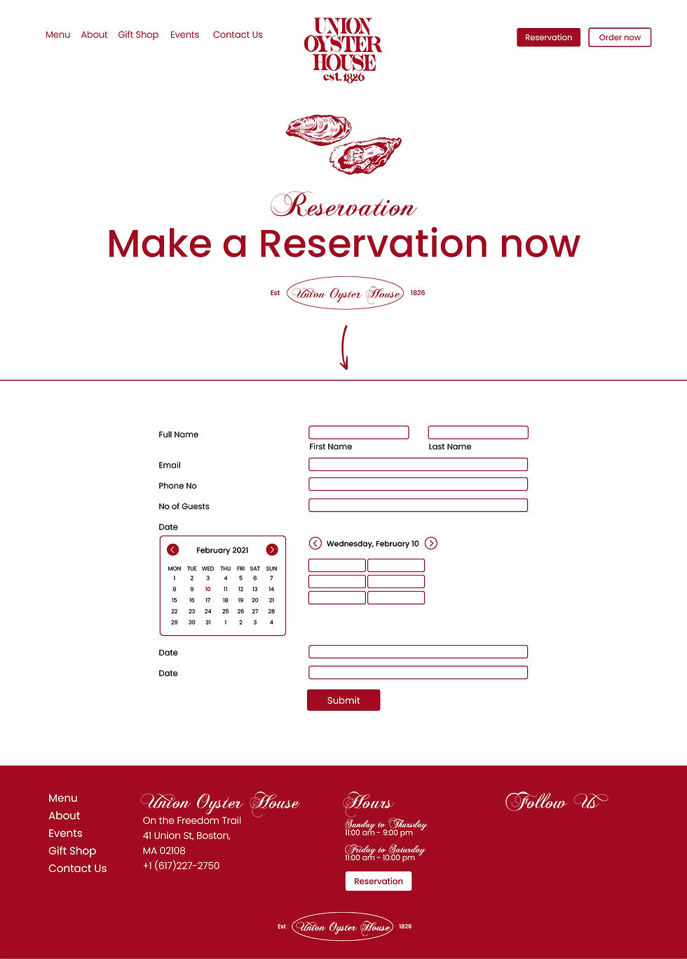
Developed a comprehensive visual style guide, including typography, color palette, button styles, iconography, and image treatments, ensuring consistency and alignment with the brand’s historic and coastal identity. Applied these elements across high-fidelity templates for core pages—Home, Menu, About, Reservations, and Contact—while maintaining accessibility and readability. Simultaneously focused on responsive design, optimizing layouts for all breakpoints and ensuring seamless performance across devices. Emphasized mobile usability through touch-friendly elements, adaptive image scaling, and collapsible content.

4
Week 14-16
Prototyping & Refinement
High-Fidelity Prototype, Peer Review & Final Presentation
Built a fully interactive high-fidelity prototype using Adobe XD (or Figma), integrating all visual and structural elements across key pages. Conducted multiple peer reviews and incorporated feedback to refine usability, visual consistency, and micro-interactions. Finalized design elements like hover states, form behavior, and button interactions to enhance the overall user experience. Prepared and submitted the complete redesign package along with documentation that explained design decisions and alignment with user needs and business goals.


Learnings
Reframing an Overcrowded Legacy Website.
The original website had no clear content hierarchy multiple font styles, scattered menus, and outdated imagery. The hardest part was rethinking how to present dense information like historical background and full menus without overwhelming the user. I had to establish clear entry points for different user intents like visitors just looking to book a table vs. tourists wanting to learn about its legacy.
Scope Management within a Fixed Timeline.
Balancing design ambition with academic deadlines taught the importance of prioritizing impact features and knowing when to polish versus when to ship.
Storytelling Through Layout is Just as Important as Visuals.
One major learning was how to create layouts that tell a brand story without relying on words. For instance, I used historical imagery and subtle nautical design cues to guide users through the brand’s legacy while maintaining a modern, intuitive structure.